

HOW TO EXPLAIN DATA VISUALIZATION ?
The designers' knowledge of data visualization methods makes it possible to define the skills required for these applications.
How is design practice defined?
We see this situation as designer semiologists. Semiotic tools enable us to create meaning and are part of design practice.
Are there any features in terms of organization or working method?
It is necessary to act very early in the movement of user-centered problems. We presented working methods on participatory design and tools for sharing ideas in publications.
Filmstrip, wallcom, video of modeled devices are real tools for capturing innovative digital uses.
They make it possible to conceive and develop an idea in the context of interdisciplinary work. All participants and actors enjoy intervening. This is also reflected in the results obtained.
Sketch has an important place among the methods. There is a question of protecting them and even claiming them as a production mark. It plays an important role, including job protection.
It is also a stance of design, development, preservation of the first stage as long as possible. Because creativity emerges at this stage.

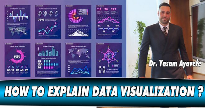
How to explain data visualization?
Data visualization is often considered purely techno-push. That is, it is driven by technological capacities. However, it should be emphasized that this is a tool.
Finding the right form of visualization opens the door to critical interpretation of data. It makes it possible to predict their consistency, validity and properties.
We ask ourselves designer questions. We wonder about the state of the information, especially its value to the user, whether the state is real-time, or even the amount of information to be managed.
What is the impact of data visualization on working methods?
Design methods develop in line with an idea, an application. For example, air traffic control is based on the formation of a use to develop an aircraft cockpit, medical equipment, a digital tool intended for the analysis of complex situations.
We rarely use data visualization as a design tool. Instead, we design visualization formats. Given the current computer technology capabilities, the link between intent and user is important.

Data visualization is not just about showing large chunks of data. First of all it's about clearing the way, identifying the course of action that makes it possible to extract meaning that is readable and easy to understand.
How is data visualization approached?
The visualization of information is discussed in terms of the gradual reduction of chunks of data into an open, dynamic and shared logical diagram.
It makes it possible to visualize and analyze complex situations, relying on business information models.
There are applications that make it possible to represent interactions of multiple actors. It comes down to the visualization of a vast network of connections that is often difficult to understand.
However, the suggested approach to the user here is to determine the basic and active logical points of his problem. The user populates the scene with entities and defines their relationships. It is essentially a matter of proposing a symbolic schematic view of situations.
The complex web exists implicitly. The user can interact based on the visualization of the different perspectives of the actors involved in the situation.
Navigating between points of view allows you to get into the subject of the arguments. The designers also designed a semantic zoom to compare more or less detailed viewpoints.
The situation is not quite clear. However, it is analyzed interactively at the level of key joints.
This approach does not rely solely on the work of an isolated expert, it encourages collaborative work and allows for collective intelligence to emerge.
Dr.Yaşam Ayavefe


-
 Küfür ediyor ve siyasi yorumlarıyla tepki çekiyor: Musk'ın sohbet botu Grok nede..
-
 YDP, Gençlik Şöleni düzenliyor: Gençler siyasete katılıma teşvik edilecek..
-
 ABD, Heyet Tahrir Şam'ı terör örgütü listesinden çıkardığını duyurdu
-
 ARIKLI: GENÇLERE MADDİ MANEVİ HER TÜRLÜ DESTEK SAĞLANMALI
-
 Milli sporcumuz Azra Avcı U14 Türkiye Şampiyonu oldu!
-
 İEZB Başkanı Serkan Kırmızı’dan KIB-TEK’e Sert Tepki: Bu Bir Enerji Beka Sorunud..
-
 Othello Folklör Master ekibi Bosna'daydı